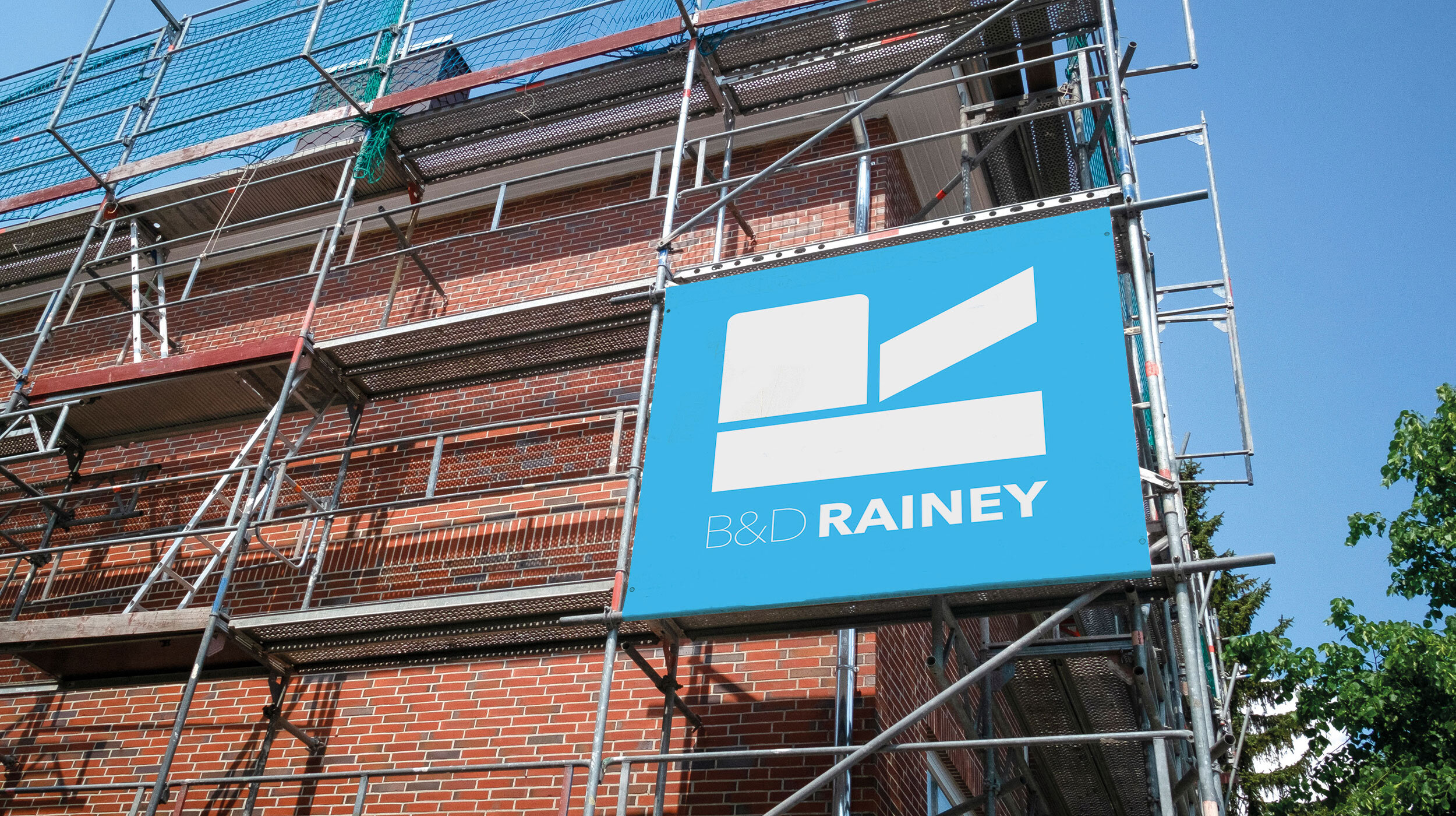
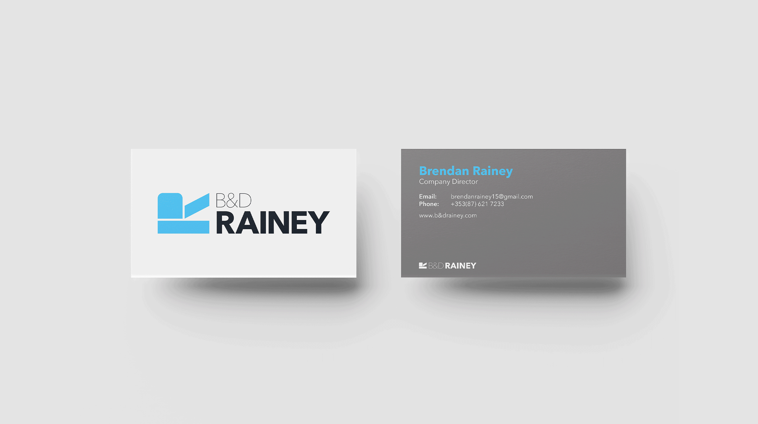
B&D Rainey
B&D Rainey is a family owned steeplejack company specialising in stone conservation, lightning protection and working at great heights. With the third generation of the family now taking over, they approached me for a rebrand. The symbol of the letter ‘R’ on it’s back is a stylised version of the letter ‘R’ at the beginning of Rainey. This brand mark represents structure and construction while simultaneously reinforcing the family name within the brand. The colour palette is inspired by the raw materials that B&D Rainey employees would come in contact with everyday. Grey represents stone and concrete while the blue is a nod to the sky and the heights the employees work at. Using variations of greys and a light blue, this colour palette evokes a sense of authenticity and trust, while also giving the identity a modern aesthetic.